Grimross
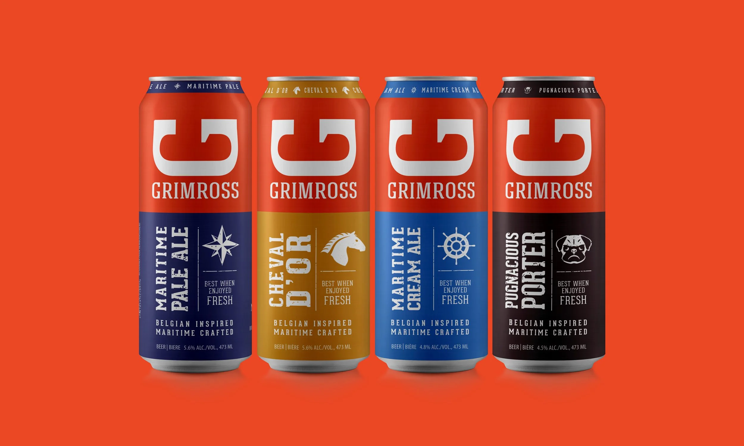
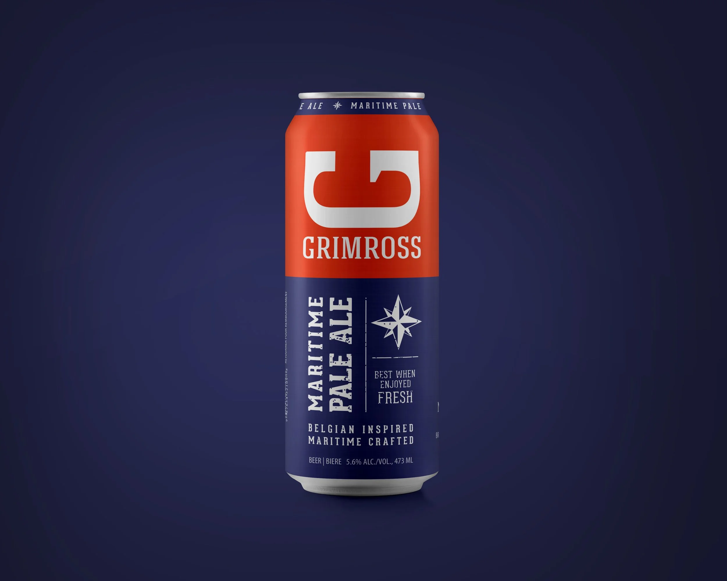
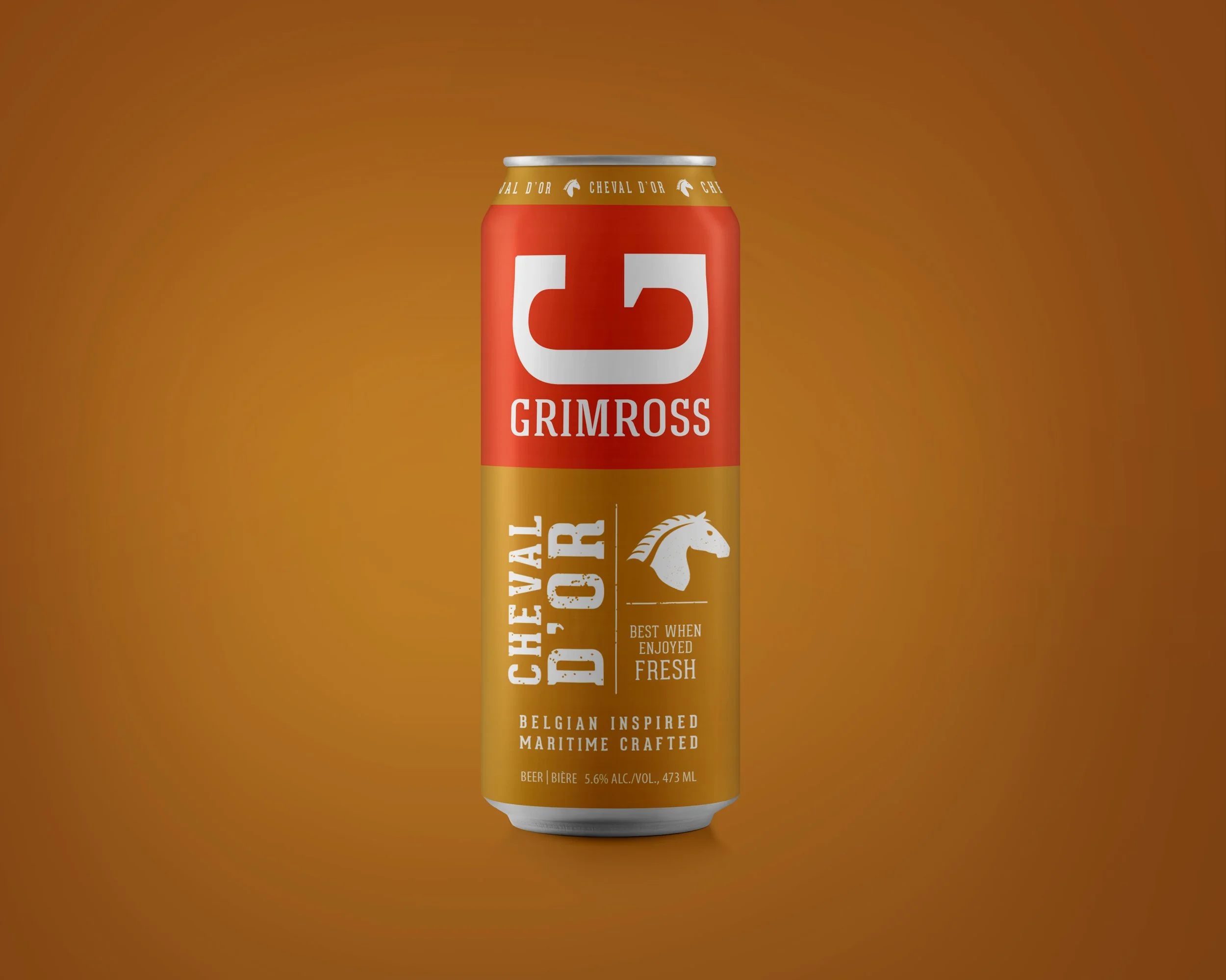
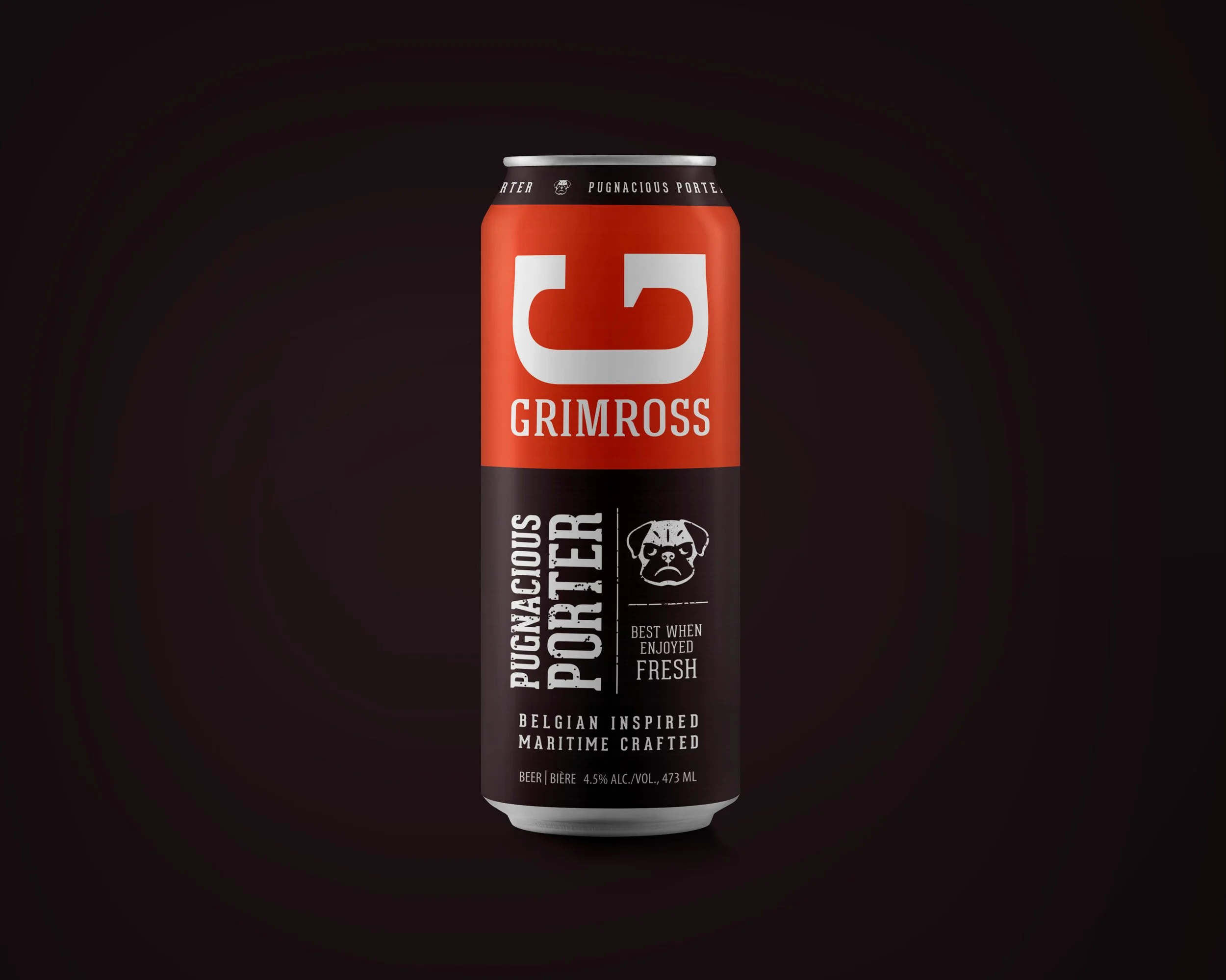
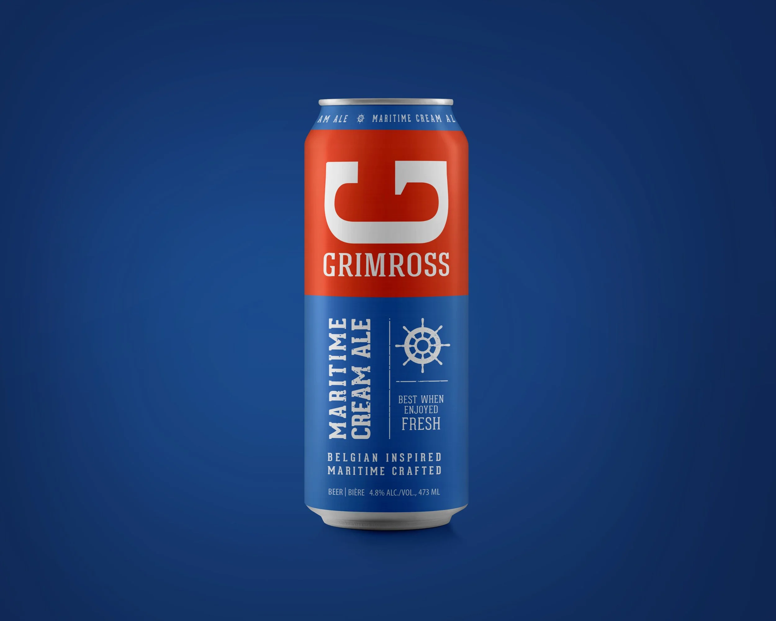
Back in 2018, the craft beer market was starting to explode in Canada. From a packaging perspective, many if not most brands were trying to stand out against traditional beer labels by producing outrageous one-off can designs. The Belgian-inspired and Fredericton-based brewery Grimross took a different route with a page out of classic CPG packaging design theory. Products need to be distinct from each other, but the “master” brand needs to be consistent. The result on shelf is a powerful block of colour and branding that draws people in, and the sub-brand colours and graphics help them make a quick choice.
Aside from the design, the beer is pretty good too. Check them out: https://www.grimross.com/